Do we really want to carry on like this?
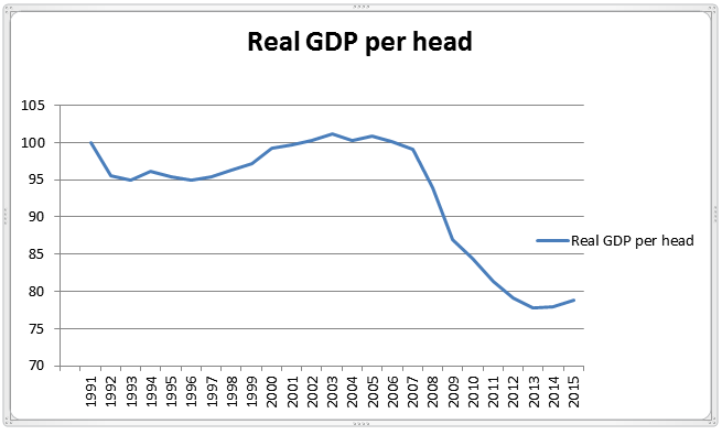
This graph shows how the average real standard of living in the UK has changed over the last 25 years (GDP ÷ population and inflation). The figures are discounted by 0.5%pa for average technological productivity growth. You can see a peak in 2004, which was when the immigration floodgates opened. Many people argue that immigration is good for our economy, but that just doesn’t show up in the figures. Judge by results. Of course the banking crisis in 2008 made the fall greater, but that has now largely washed through, and anyway the index is down to below 100 by 2008. Yet we are still 22.5% worse off than in 2004 (excluding productivity growth).
The index is set at 100 for 1991. If I had included 1990 the starting point would have been higher than 2004! The benefits of the 1992 ERM exit devaluation do show up quite clearly though.
There are clearly four principle factors involved here: productivity, immigration, the trade deficit with the EU (which exports jobs) and the banking crisis. I have tried to isolate the effect of immigration and the EU trade deficit by removing productivity by the admittedly rather crude expedient of assuming a constant rate of 0.5% per annum. It would in fact have been likely to have been higher before 2004 when investment was buoyant, and lower thereafter. I have not however so far found a way of removing the effect of the banking crisis, so the graph still shows the two effects combined. I shall have a look at levels of perhaps consumer borrowing as an indicator of the latter and edit this post shortly accordingly.
